GGLeagues is a small eSports league that sprouted from the idea that leagues should be available to recreational players, not just competitive gamers.
Time
4 weeks
team
5 people
ROLE
UX Designer
Budget
Low
the CHALLENGE
GGLeagues provides casual gamers a way to compete against each other in a fun, friendly, and low pressure league. Before our kickoff meeting, my team was asked by the CEO, Erich, to look at the following areas for redesign and development:
We asked Erich to walk us through this list in order to get a sense of his priorities and what seemed feasible with our timeline.
We identified two key areas of focus…
the DISCOVERY
eSports is a billion dollar industry that’s only growing.
Professional eSports players are able to make a lot of money through winning tournaments, streaming their game-play on sites like Twitch, signing with professional competitive teams, signing brand deals, and merchandising. With so much focus on “going pro” and making money, all of the big competitive leagues are exclusively for a few very skilled individuals.
From our research and speaking with users we learned…
1.
Less skilled players want to be able to participate in friendly competitions and leagues but the industry doesn’t have much set up for organized recreational competition.
2.
GGLeagues doesn’t provide updated or thorough enough stats on the teams and players.
3.
Users think the website is hard to use and the information is displayed counterintuitively.
4.
Communication could be more streamlined, integrated, and tailored to the league.
the SYNTHESIS
We framed the problem as the following:
Enthusiastic eSports players need a digital way to stay connected with gaming and league information and content in order to enjoy being a part of an active, cohesive community of gamers, beyond just being competitors, which includes personal growth and progress as part of a team.
Going into concepting, we were confident in our assessment but still aware that our hypothesis looked slightly different than our client’s. We knew he was focused on community and friendship building, and wasn’t as interested in player statistics as his users were.
It turned out there was also a natural split in my teams’ sketches. Some of us went straight to statistics and league information, while the rest were drawn to the community-first approach, where player stats and profiles were displayed in a more “get to know me” way.
Combining the two ideas at this stage would mean picking which approach to use for each piece of the website, and that involved more assumptions than we were comfortable with. So we created our two sets of wireframes, lovingly named “Performance” and “Connection.”
CONCEPT 1: “Performance”
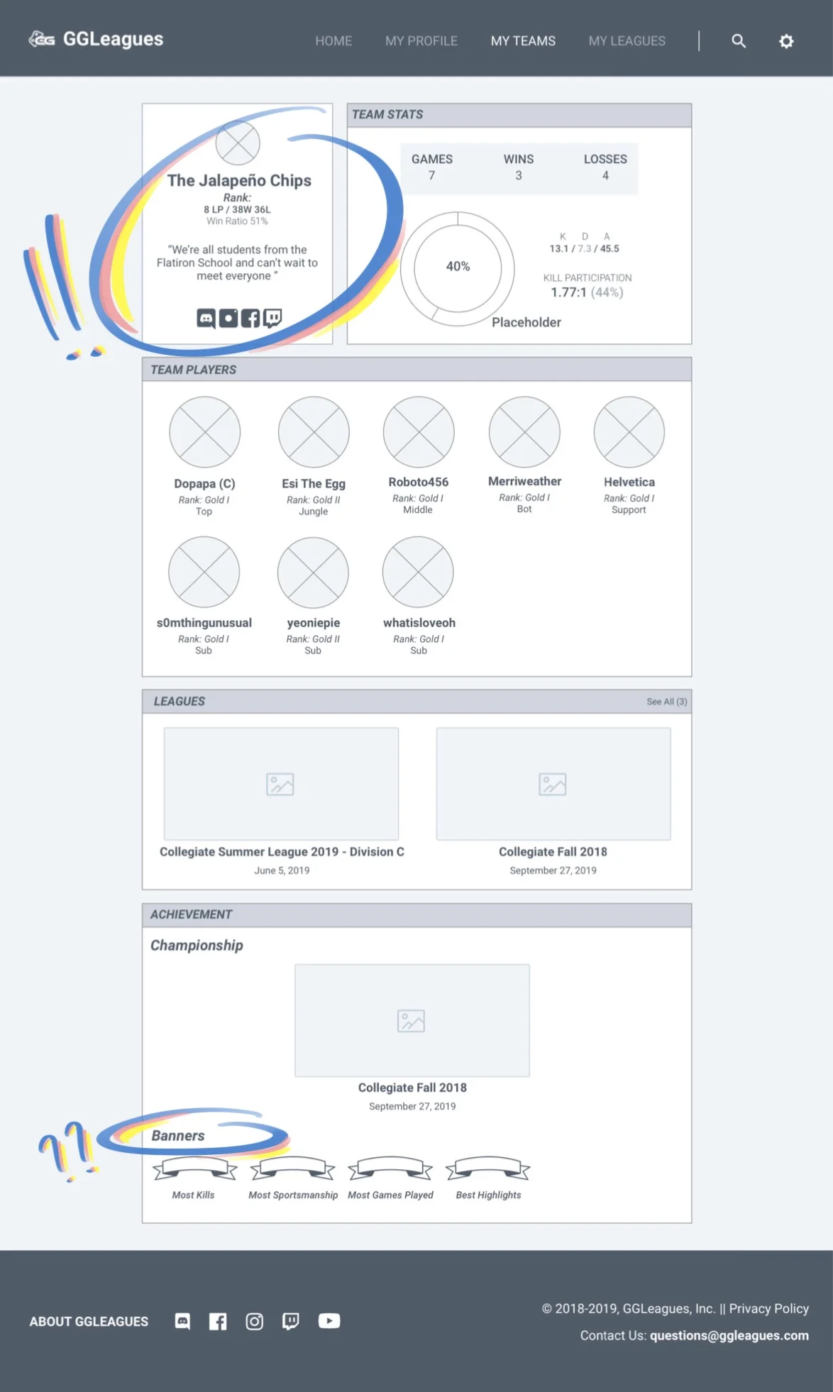
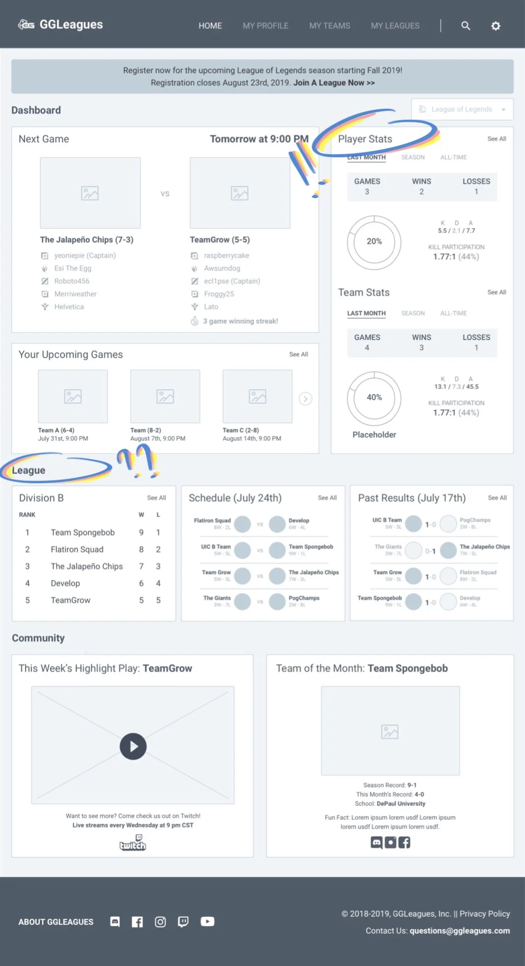
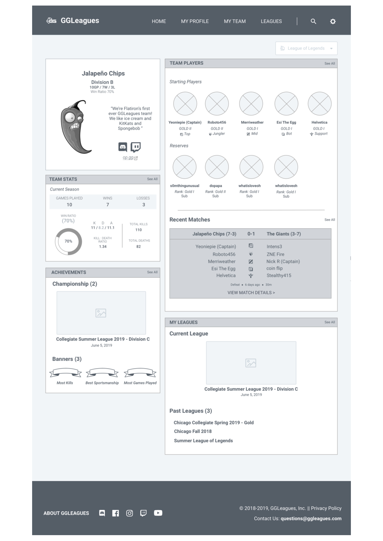
Our “Performance” concept focused on detailed statistics and creating community by recognizing players for personal and team achievements.
Users liked that there was a personal element to the team profiles but thought there could still be more.
Users were excited about the idea of awards and recognition but were unsure how the “Badges” and “Banners” system works.
Users liked that the stats are the main focus of this page and concept. They said they liked all of their information living in one place because this would make seeing how well their team is doing or scouting the other team easier.
While users liked the stat focus, they said some parts of this page, specifically the sections under “league” felt too busy.
CONCEPT 2: “Connection”
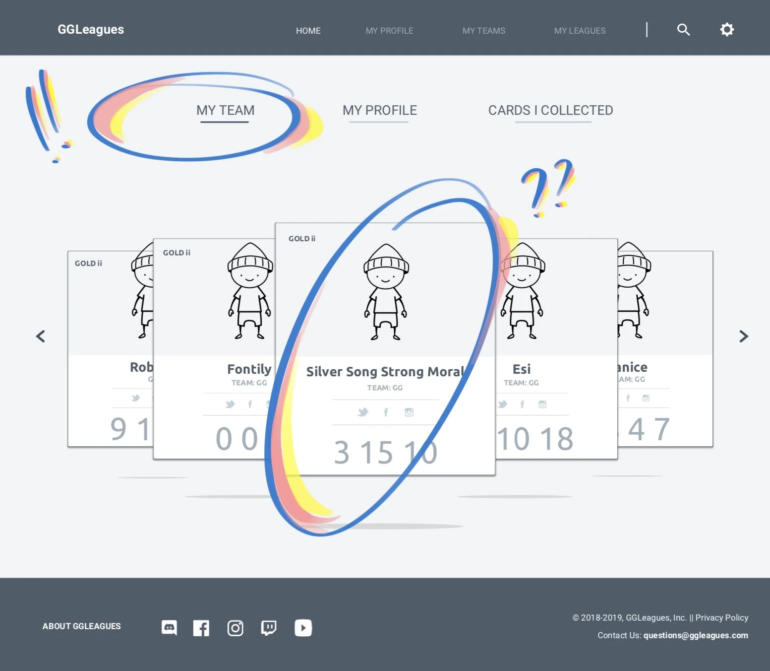
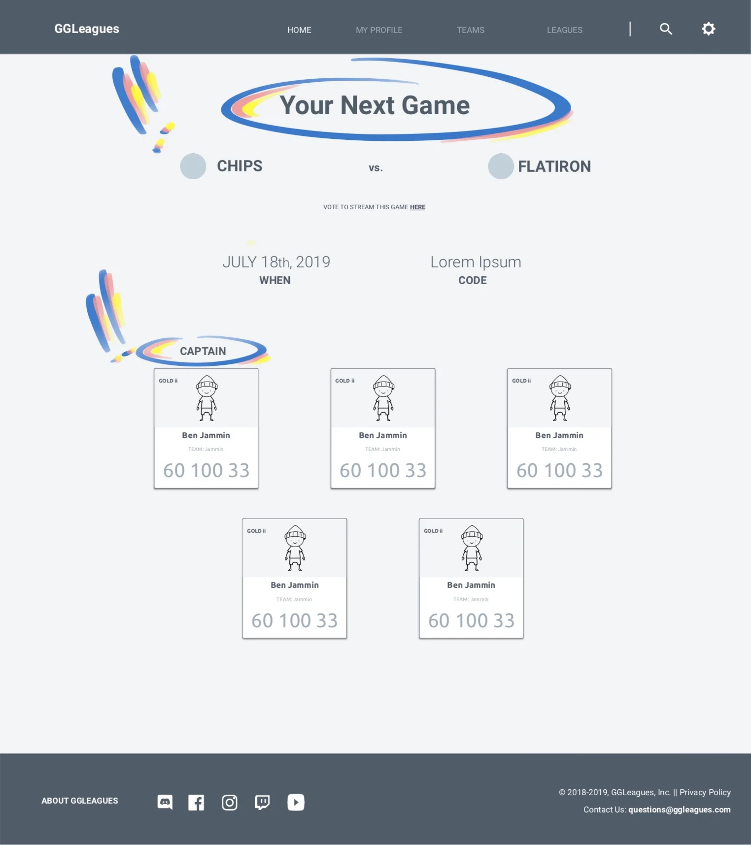
The “Connection” concept focused on creating community through encouraging players to make new friends with other GGLeagues members, through more personalized pages and interaction.
Users said they liked the idea of having a quick way to scout the other teams and see their own team information but wanted more stats and more info than is shown here.
Users also liked the look of the “player cards” but didn’t understand their function within the website.
Users liked being able to see information on their next game and stats for the opposing team at a glance.
From Concept Testing we learned…
1.
Users care more about being able to scout and see statistics than they care about the community aspect.
2.
Users think badges are a nice way to recognize a player or team’s achievement, regardless of their skill level.
3.
Users like all of their information in one place.
the ALIGNMENT
When we walked the client through the two sets of wireframes, we were hoping he would see what our team and the users all saw, and, going through our wireframes and results, he did.
He told us something similar to what the users reported:
the OUTPUT
We still had to find a way to integrate community building into the performance and stats-based design. So to build our final prototype, we added pages and more information to our “Performance” concept, as well as elements from the ”Connection” concept.
I worked on promoting more of a personal touch to the profiles through bios, pictures, and links to the player or team’s Discord and Twitch.
We added wireframes of a discussion board as a tool for quick and easy communication between teams and players.
The discussion board is intended to streamline communication before a game, with notes such as “I’m running late” or “here’s who’s on the roster for today’s game.''
We made wireframes for a “post-game” modal that would appear when a player logged back into GGLeagues after playing a match.
The Post-Game modal is intended to connect players once their match was finished, with prompts such as “tell the other team ‘Good Game’” and “schedule a scrim.”
the OUTCOME
When we put the final prototype in front of users, we were testing for two different things: usability for the screens we improved from our concept round, and high level interest in the new concept screens we developed after the concept round.
This was tricky. Synthesizing quantitative usability data and detail-focused observations with high-level insights from concept testing was a lot harder than we anticipated. So we kept the results separate.
1.
Usability: Team Profile
Users found the navigation easy and intuitive. They also found the information useful: the stats displayed were now consistent with the ones they considered important when scouting.
2.
Concept: Discussion Board
Users experienced some difficulty navigating to the discussion board but thought that it was a useful feature because anyone would be able to write in it, including admins, captains, and players. Users said that allowing anyone to use this tool makes them feel more involved in the league and directly connected to each other.
3.
Concept: Post-Match Modal
Users were generally positive about the post-game modal. Testers identified the modal as a reminder system that might make them more likely to use the prompted features. While users liked the prompting feature of the pop-up, our team found that users wanted this information to be available elsewhere as well, so that it wouldn’t only be accessible after a game and on a pop-up that would go away.
project TAKEAWAYS
I learned a lot from this project, mostly how to be scrappy in the face of project constraints, which will always exist.
The limited amount of time we had for this project meant having to push some things around, together, backwards, etc. I saw this when we started trying to synthesize data from concept testing and usability testing.
It was hard to keep track and make sense of our findings because these tests yield different results. We were dealing with quantitative data and feedback about minor visual choices and hierarchy from our usability test, as well as higher level insights about the general approach from our concept testing of the new screens.
Apples: Usability Testing Data
Oranges: Concept Testing Data
Still, it’s hard to say that I would have done the testing differently. In an ideal world, we would have been able to test these separately and build the two sets of wireframes (the usability tested ones and the concept ones) to be at the same level of development at the same time but, again, there were constraints. We didn’t have the time to test the two separately. We also scrapped our “connection” approach but not the concept of connection itself, leaving us with an output that didn’t reflect our desired outcome.
So we adapted and built new pieces that we thought would more successfully allow for community building. The test wasn’t ideal, but projects come with restraints, so all in all, I’m glad we were forced to get a bit scrappy with this one. Not only am I happy with the work we did, but it also taught me a lot about making lemonade.


